UX/UI Case Study
Museum Audio Tour
Creating a better virtual experience for museum guests
Industry:
Arts
Platform:
Mobile App
Location:
USA
PROJECT OVERVIEW
SUMMARY
Modern museum visitors wanted a better way to independently experience the arts
This audio tour app is designed to be a platform for museums to host their digital museum tours. Users will have access to thematic tours carefully crafted by the museum, along with having the ability to customize their own tour or free roam the museum with a digital aid.
This is a valuable app for those who enjoy having a private experience at a museum, or who otherwise social distance for personal or health reasons. Additionally, the app doubles as a guidebook and provides maps, historical facts, and painting techniques.
PROBLEM
Many audio tours are poorly designed, difficult to find, and rarely consider the ways that the physical and digital space will interact
Several museums host their audio tours on external websites, which were incredibly difficult to find and poorly optimized for mobile devices
Many audio tours made no reference to the physical space within the museum, or failed to provide maps with recommended starting locations
Almost no audio tours offer subtitles or written transcripts, which makes them extremely unaccessible to those with audio impairments
Very few audio tours provided images of the paintings during their audio segments, which makes it difficult to verify you are looking at the correct painting
PROJECT GOALS
01/
Blend the physical and digital experience into the audio tour app
02/
Make audio tours more accessible, both through ease of use and considerations for disabled populations
MY ROLE
UX designer. A solo project from concept to design.
RESPONSIBILITIES
💭 Design Thinking Process
🧐 Research
🗣 Interviews
✍ Paper and Digital Wireframe
🎨 Style guide
🏊🏻♂️ User Flow
✨ Low and High-Fidelity Prototype
👨🏽🦽 Accessibility
🌱 Usability Studies
USER RESEARCH
SUMMARY
I conducted surveys and interviews, which were then turned into empathy maps - These were used to understand the current grievances with museum audio tours, and what features users wanted most
Many users had an experience-altering issue with their audio tours, but still preferred the solitude the audio tours provided.
Docent-led tours are considered more valuable due to the personalities or knowledge they possess, but audio tours offer more emotional comfort and convenience.
PAIN POINTS
Images
Audio tours that don’t include photos of the paintings during their audio segments can make it difficult to keep on track
01
Control
Whether it’s repeating the previous segment, skipping a painting they don’t like, or pausing to run to the restroom, users need full control over their audio tours
02
Content
The quality, writing, and charisma of the audio tours needs to be impeccable; Users utilizing audio tours can’t rely on reading body language or asking questions to retain interest
03
Maps
Audio tours that don’t include maps or references to physical spaces within their audio tours risk creating a frustrating experience for users, who won’t know where to begin or where to walk to continue the tour
04
COMPETITIVE AUDIT
Research showed that there was no consistent standard for museum audio tours. They had extreme ranges in quality and features, despite having ample funding and receiving millions of visitors a year.
PERSONAS
USER JOURNEY
USER FLOW
DESCRIPTION
When it came to selecting tours, I wanted to provide opportunities for customization while also making the experience feel intuitive
LOW FIDELITY
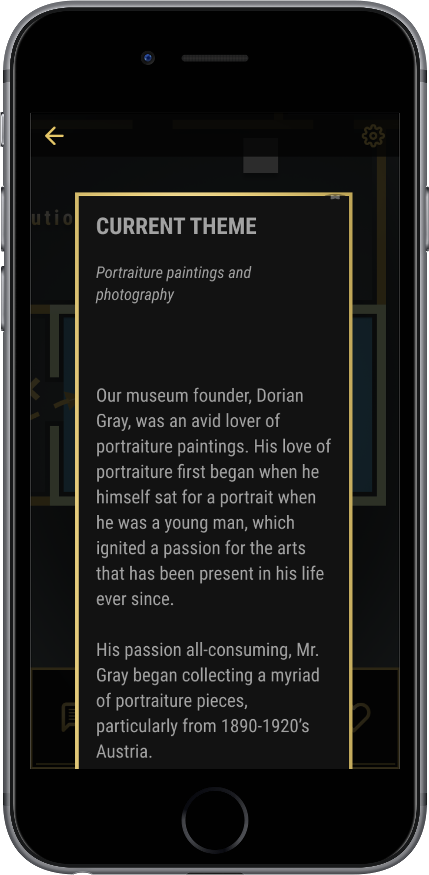
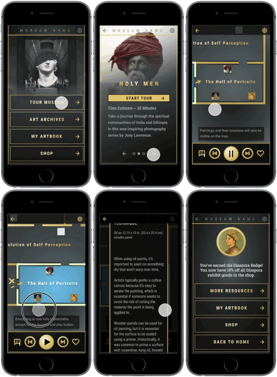
The tour screen is where the user will spend the vast majority of their time within the app. This screen shows a true-to-life layout of the museum, along with the locations of paintings. The paintings themselves are also interactive, and when tapped, they will bring up additional information about the painting.
Users will also have full control over their audio, and will have the ability to jump forward and backwards within their tour. Additionally, every tour will have subtitles and transcripts accessible while the tour is on-going.
THE TOUR
USABILITY STUDY
FINDINGS
I conducted two rounds of usability studies. Discoveries from the first study helped to guide the designs from wireframes to mockups, and focused on testing accessibility. The second study utilized a high-fidelity prototype and revealed what parts of the design needed refinement
Change “Visit Museum” to “Tour Museum” to make wording clearer
Offer ability to skip tutorials
Add ability to swipe screens on tour mode pages
Make start tour button more distinct from tour header
Add exit tour confirmation
THE DESIGN
STYLE GUIDE
TYPOGRAPHY
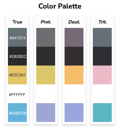
COLORS
ACCESSIBILITY CONSIDERATIONS
01/
Contrast and colors were carefully chosen to provide access to users who are colorblind
02/
Included the ability to turn on subtitles, so that those with audio impairments could partake in digital tours
THE SCREENS
THE HIGH-FIDELITY PROTOTYPE
TAKEAWAY
IMPACT
This app allows users to really capture the most interesting parts about a museum, and bundle it into a private experience - One that isn’t only adequate, but delights! Additionally, the features provided will make previously inaccessible tours available to disabled populations.
One of my usability study participants had this to say about the app:
“I really just liked the option to choose between different exhibits. Really narrow it down to what part of the museum I’d be interested in. I love this badge, I have other apps like Audible that have badges, like ‘Oh you’ve listened to an audio book that’s over 20 hours,’ or ‘You’ve listened to an audio book for five hours at night’ and it gives you a badge. And getting a discount with it is very, very cool. And I like that that’s not telegraphed beforehand, so it’s not like I’m going to go and click through and just get this discount. You kind of have to earn it.”
WHAT I LEARNED
While designing this audio tour platform, I realized the importance of prototype scale and time allocation. Rather than building out one tour, I built out three. By the time I had finished the high fidelity prototype, I had 272 individual screens. At the time I had wanted to give a true-to-life experience for our usability testing sessions, but in hindsight that level of scale wasn’t necessary.

Next up


