UX/UI Case Study
SpeakEasel.jp
Bringing fun and creativity into foreign language study
Industry:
Education
Platform:
Mobile App
Location:
USA
PROJECT OVERVIEW
SUMMARY
After a lifetime of studying foreign languages, I wanted to create a more engaging way to independently study
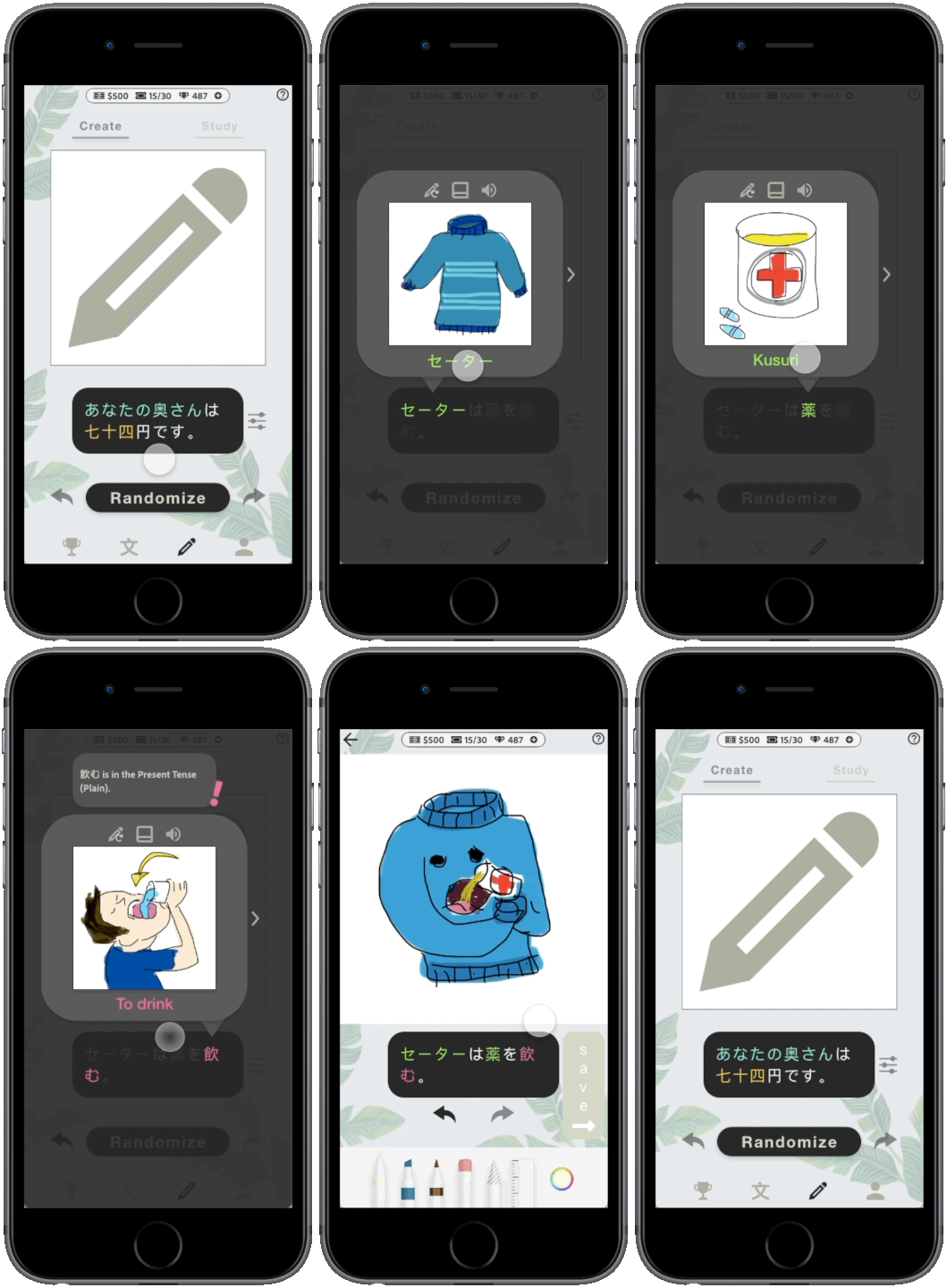
SpeakEasel is an educational app, focused on generating grammatically-correct randomized sentences from a user’s personal vocabulary lists, and combining these sentences with user generated illustrations.
This is incredibly valuable for beginner to intermediate students, who may struggle with finding books, TV shows, or music that they are able comprehend based on their current knowledge. This allows users to practice spontaneous comprehension, while encouraging visual language associations.
PROBLEM
Classical study methods for beginner to intermediate language students aren’t conductive for long-term comprehension
Most beginner students rely on flashcards, rote memorization, and workbooks. This teaches students almost no practical communication skills, and often results in students believing they aren’t capable of learning their target language.
This reliance on an internal dictionary also tends to cause a processing delay, as they have to mentally translate everything into their native language for comprehension.
Current study methods are built around standardized testing, instead of spontaneous comprehension and creative language use. This often results in students being unable to communicate outside of scripted academic environments.
PROJECT GOALS
01/
Users need a way to practice spontaneous language comprehension
02/
Users need to develop symbolic / visual associations (猫 = 🐱) with their target language
MY ROLE
UX designer & iOS developer. A solo project from concept to creation.
RESPONSIBILITIES
💭 Design Thinking Process
🧐 Research
🗣 Interviews
✍ Paper and Digital Wireframe
🎨 Style guide
🏊🏻♂️ User Flow
✨ Low and High-Fidelity Prototype
👨🏽🦽 Accessibility
🌱 Usability Studies
💻 Data Architecture
☕︎ Full-stack Development
💡 Database Creation & Management
USER RESEARCH
SUMMARY
I conducted surveys and interviews, which were then turned into empathy maps - This was used to understand the initial stages of foreign language development, along with my personal experience as an ESL teacher
Users saw rapid improvement in grammar comprehension when creating illustrations for sentences during study sessions
Users had increased levels of motivation over longer periods of time when they had lower-stress environments combined with activities that required creative output
PAIN POINTS
Barrier To Entry
Users sometimes have to spend years studying their target language before they are able to understand books, shows, movies, or music
01
Time
Adult users in particular find that they don’t have much time during the week for long study sessions
02
Writing Systems
Some users find it extremely challenging to learn new alphabets and writing systems, and it causes them to lose motivation early on
03
Expense
Many users don’t have the funds necessary to travel to countries that speak their target languages, and therefore have less opportunities to practice spontaneous comprehension
04
COMPETITIVE AUDIT
Research showed that there were several strong competitors, but none of which that used the same approach in their products.
PERSONAS
USER JOURNEY
USER FLOW
DESCRIPTION
For the sentence generator, I prioritized a minimalistic design that reduced the mental load on users
LOW FIDELITY
The random sentence generator pulls vocabulary words and sentence structures from the user’s database, and then generates a random grammatically-correct sentence. Users can also filter the generator to practice specific levels, conversation topics, and grammar types.
Since the generator is pulling from the user’s personal vocabulary list, users should find themselves with a much higher chance of being able to read every sentence they generate! If the user does happen to forget a word or needs a reminder, they can tap the word to pull up a visual dictionary.
THE RANDOM SENTENCE GENERATOR
USABILITY STUDY
FINDINGS
I conducted two rounds of usability studies. Discoveries from the first study helped to guide the designs from wireframes to mockups. The second study utilized a high-fidelity prototype and revealed what parts of the design needed refinement
The illustration “Save” button needs to be more visually distinct
Explain the text color system to new users
Have a tutorial for the dictionary features
New users want clarification on the numbered bubbles in the sentence overlays
Word / sentence store menu needs to be simplified
THE DESIGN
STYLE GUIDE
TYPOGRAPHY
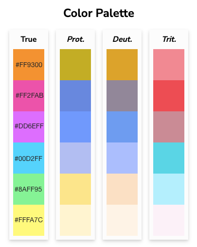
COLORS
ACCESSIBILITY CONSIDERATIONS
01/
Text colors and contrast were carefully chosen to provide access to users who are colorblind
02/
Included an audio option for automatic text to speech reading during sentence generation, for visually impaired users
THE SCREENS
THE HIGH-FIDELITY PROTOTYPE
TAKEAWAY
IMPACT
During my time as an ESL teacher, it was deeply important to me that my students received an education that was both entertaining, creative, and customized for their interests. SpeakEasel bundles up these important elements, and gives users the ability to do it themselves without the expense of a personal teacher.
One of my usability study participants said this about SpeakEasel:
“It’s really weird not knowing sentence structure, but still being able to figure out what it means. Seeing it in action and seeing how it relates… I got to put a personal touch to it that would help solidify the concepts in my brain. I found myself wishing this was a real app [instead of a prototype].”
WHAT I LEARNED
While designing SpeakEasel, I learned the importance of understanding your development team, production scale, and defining a minimum viable product. I am also the iOS developer for SpeakEasel, and a few months into development I realized that for an initial product launch, it would be more practical to launch the core features covered in this case study first.

Next up


